Do you want to take your animations to the next level? In this article, I will show you the 12 principles of animation. Create fundamentally sound animation with these foundational guidelines.
Table of Contents
What are the 12 Principles of Animation?
4) Straight-Ahead vs. Pose-to-Pose
5) Follow Through, Overlapping Action, and Drag
Key Takeaways
The 12 Principles of Animation are the basic must-know techniques for creating dynamic, realistic, and engaging character and object animations.
These principals will overlap each other in terms of implementation, and that's completely normal.
Adopting these techniques into your animation work will make you a pro!!
What are the 12 Principles of Animation?
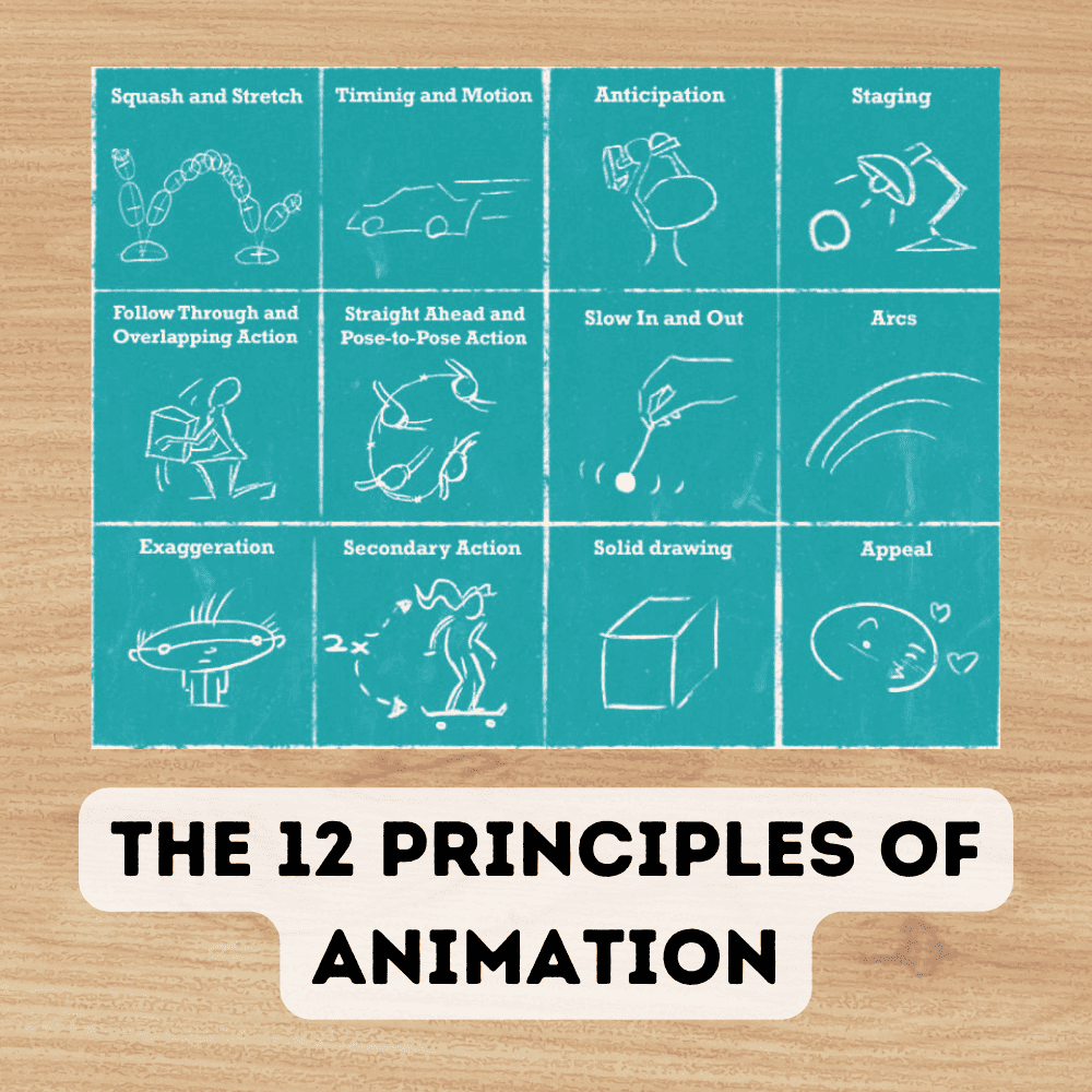
Disney animators Ollie Johnston and Frank Thomas were the originators of The 12 Principles of Animation, which was introduced in their book “The Illusion of Life”.
These principles assist traditional as well as computer animation by providing a foundation to build engaging characters with sound physics.
By applying these rules to your animation work, you will be able to create fundamentally sound animations that communicate stories effectively.
1) Slow In, Slow Out
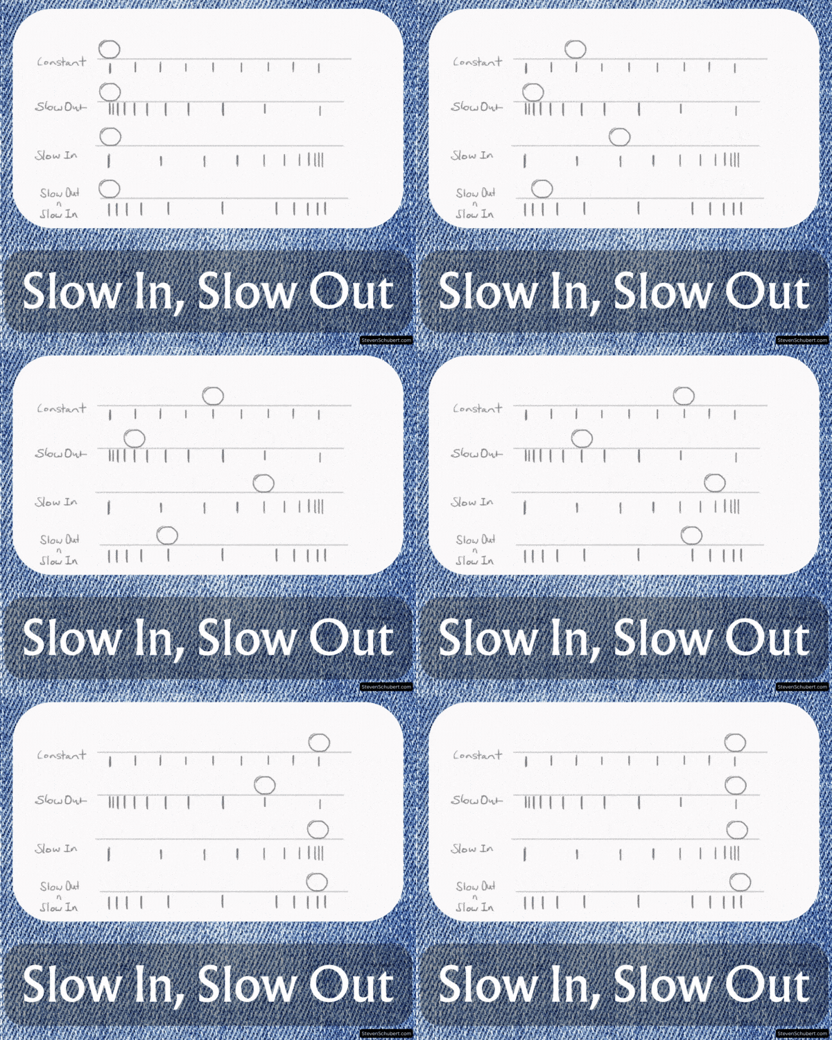
The practice of slow in and slow out which is also referred to as ease in and ease out, is essential to achieving realistic animation.
As an example, when a bouncing ball reaches its peak point before falling again, the speed needs to gradually increase for that motion sequence to look believable.
The proper spacing between poses can assist with this approach by slowing movement at key points throughout the action arc. Leading to a fluid and natural look.
In other words, create more poses when an action is starting, stopping, or changing. And less poses for when the object or character is already in motion.
2) Anticipation
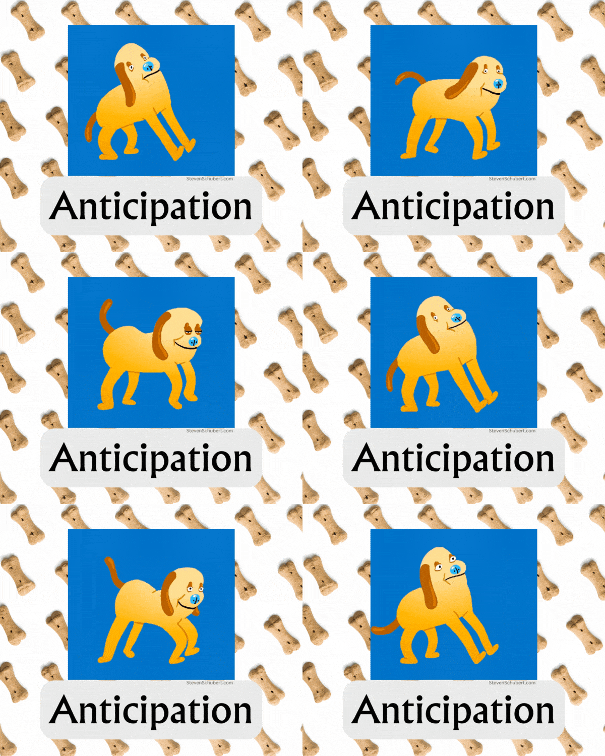
The principle of anticipation is used to visually prepare viewers for an upcoming action. It's pleasant to the eye to add anticipation to your character's actions because they look like realistic movements.
When implemented effectively, it can create a realistic motion that can tell a story without words.
In the GIF above, the dog leans (or anticipates) back first to gain momentum and then uses that momentum to swing forward.
When a character is leaping off their feet, for example, there should be some kind of buildup beforehand. The character's body bends downward before jumping up. When landing, the character's body will make several anticipations, shifting weight back and forth, until the body finally settles.
3) Staging

Staging is a broad animation principle that involves focusing the viewers’ eyes on the most crucial aspects of any given scene. Essentially, staging is meant to make things more clear and understandable for the audience.
Animators use physical elements of the scene, including lighting and camera angles, to change a boring or confusing scene into a more obvious and inviting scene.
You can also apply any of the other 11 animation principles to address a staging issue.
Too much happening on the screen at the same time is bad staging because the audience gets confused and disengages from the scene. It may be the case that the animator is trying to confuse to viewer. But usually, good staging involves guiding the viewer's eyes, in an easy-to-understand fashion, step by step.
4) Straight-Ahead vs. Pose-to-Pose
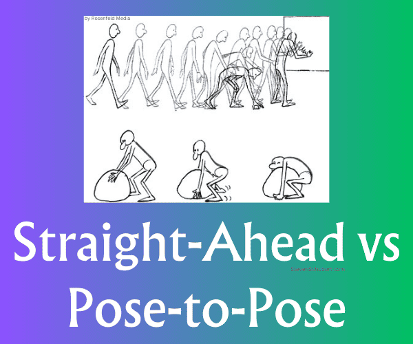
Straight-ahead action and Pose-to-Pose are two distinct animation approaches, each with its advantages and drawbacks.
Straight-ahead action involves consecutively animating every frame from the beginning to the end of a sequence. This method is the more straightforward way to draw but is usually not the best approach because you run the risk of making disorderly animation. Straight-ahead animation is great and preferable for secondary elements such as water splashes, hair movement, fire burning, etc.
Pose-to-Pose animation involves generating and mapping out the key poses first, then creating the in-betweens. This is the best way to animate characters because it allows animators to scope out any problems early on. The animation will also stay uniform. However, the workflow is a bit more scattered and not good for secondary elements.
There are four main parts to a Pose-to-pose animation: Keys, Extremes, Breakdowns, and In-Betweens. With the aid of animation software, animators can first focus on drawing key frames and then extreme frames. After that, let the software generate the breakdowns and in-betweens.
5) Follow Through, Overlapping Action, and Drag

All 3 of these techniques work together in conjunction to display proper physics, creating a convincing look.
If a character abruptly stops running in animation, for example, they should be depicted as still having some momentum left. This adds weightiness, depth, and realism.
Follow Through: this occurs when a character or object slightly overextends forward before settling. Then, the secondary elements follow through and then settle back, following the primary element.
Overlapping action: components, such as the arms, may move at different rates than legs in a walking or running animation, for instance.
Drag: secondary parts of a body or object, like hair, can drag behind the primary element by a few frames.
6) Exaggeration
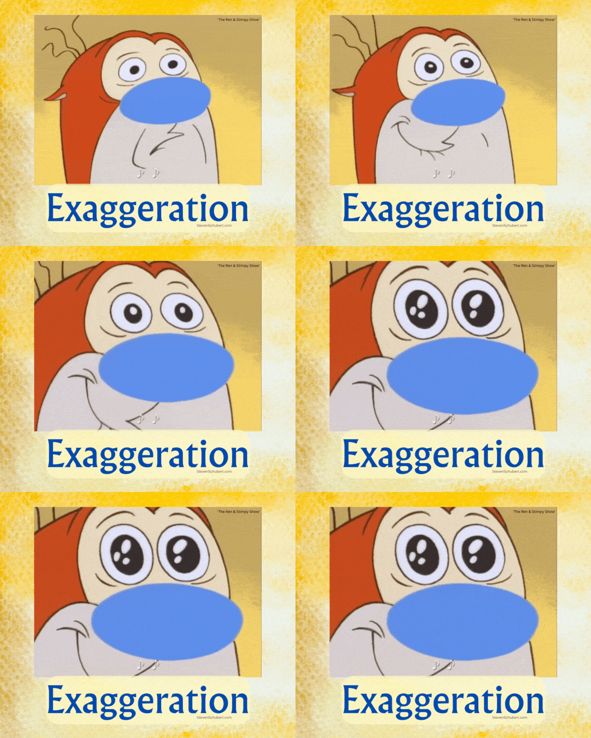
The principle of exaggeration involves intentionally pushing a character's expressions and movements. This adds energy and drama to your animations.
For example, emphasizing certain emotions through exaggerated facial expressions can reveal how intense a scene is. Likewise, stretching out body parts during action sequences adds dynamism as well as weight.
Use exaggeration strategically to highlight specific events better.
7) Appeal
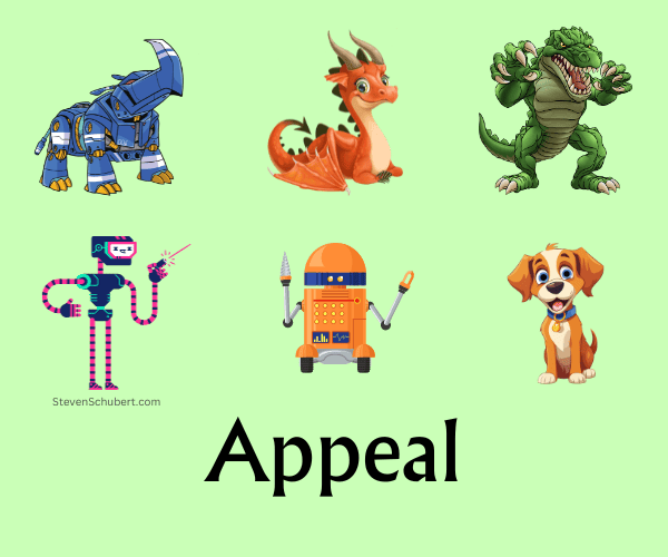
This principle refers to winning your audience over by using memorable and likable characters. Even the villains should be visually attractive to the viewer.
When inventing a new character design, appeal can be achieved by using unique proportions, interesting combinations of shapes, and not overcomplicating a design.
Too much unnecessary detail will create too much work for the animator and will overwhelm the audience with too many things to look at.
A character's voice, colors, clothes, and accessories also contribute to their overall appeal.
Finally, the other 11 principles all add to the appeal of an object or character animation as well.
Giving your animation that extra bit of charm and personality is worth it because it will hook the audience in.
8) Timing and Spacing
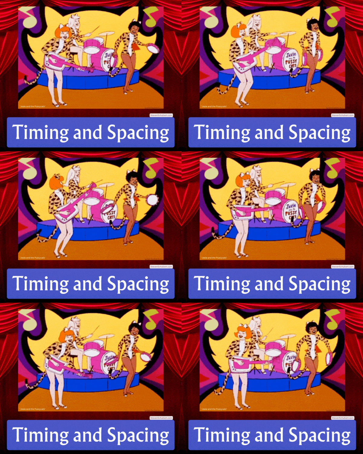
The timing and spacing of an animation are essential for conveying emotions, personality, or tempo.
Timing focuses on how many frames exist between each pose. Using many drawings creates a slower or more fluid effect. Using fewer frames produces faster movement.
For instance, one might slow down particular movements to signify sadness while they can also speed up other motions when portraying excitement levels.
Spacing in animation refers to how much a character or object moves its position between each frame.
For example, if an object is moving quickly, it would have larger spaces between its position in each frame. Conversely, if an object is moving slowly, the spaces between its positions in each frame would be smaller.
Drawing on "ones" means there is a drawing for every frame. This tactic is great for fast actions when detail is needed, but is usually overkill in most scenarios.
Drawing on "twos" means there's a new drawing every two frames. This is the industry standard and most animators prefer to draw on twos.
Drawing on "threes" further reduces the amount of work for the animator. However, now the animation looks a tad bit choppy.
9) Secondary Action

Secondary Action helps to provide an additional layer of depth that can support the main action, without stealing focus.
For example, if a character's main action is running, then a secondary action can be the runner tapping on his Apple watch and checking the time.
Facial expressions during dialogue or movements in clothing when a character moves around are also secondary actions.
It's important to keep the main action the main action, and the secondary action the secondary action. Or else the audience will be confused and lose interest.
10) Solid Drawing
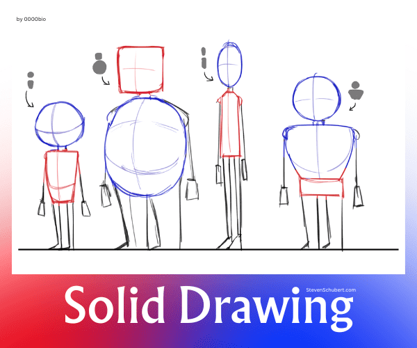
Solid drawing is an important principle to remember and refers to your characters and objects having good volume, balance, and weight in their designs and animations.
Carefully craft characters and objects with consistent proportions in a three-dimensional space.
This animation technique, just as the other 11 principles do, adds to the depth and believability of your work.
Watch out for mirroring actions or twinning, which, for example, might be two arms doing the same motion. Experiment and add some unevenness to your animations.
Adding overlap to a drawing eliminates the error of having all the layers appear to be on the same level. Overlap is created by strategically adding lines to your drawing, which helps to define where the layers are on the object.
11) Arcs
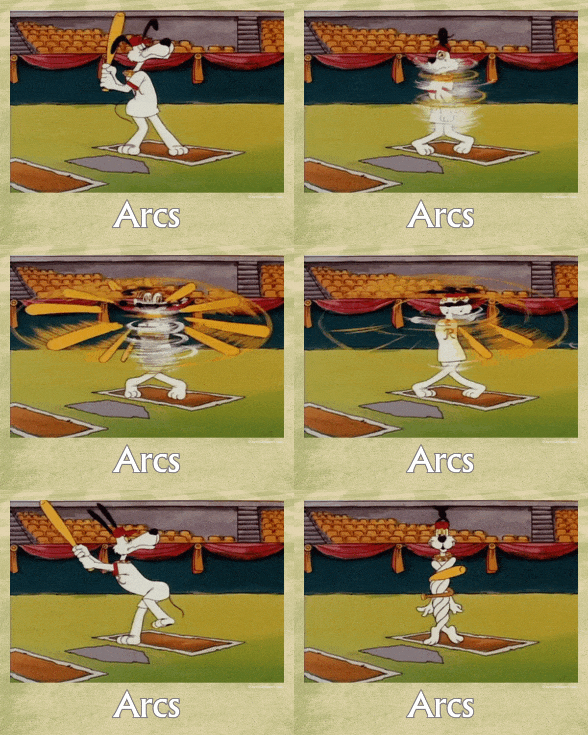
Using arcs in animation helps to create natural and lifelike motion by having objects or characters move along curved trajectories rather than straight lines, making the overall movement more organic and fluid.
For instance, an arm might reach out following a curving path instead of just going in a straight line, directly from one point to another.
Also, when throwing something like a ball, there should be a visible arc-shaped trajectory that follows through the air realistically.
12) Squash and Stretch

It's easy to overdo this principle, so only use it when necessary.
Adding squash and stretch provides a sense of weight, mass, momentum, speed, as well as flexibility to objects or characters.
When an item is squashed or stretched, its volume needs to remain constant.
To keep the volume consistent, the object or character must temporarily flatten if it's hitting a surface and become longer and thinner when gaining speed.
A good example would be a dodgeball. It squashes during an impact and stretches when airborne.
A stiff object will not have much squash or stretch. But a softer object will have a lot.
Summary
To summarize, knowing and utilizing the 12 principles of animation allows for realistic movements in your animations.
Having a strong understanding of these rules results in dynamic creations.
All these principles help to give a more accurate representation of what characters and objects would do in real life.
Conclusion
Any aspiring animator or creative wishing to create captivating, realistic animations that tell a moving story must become proficient in these principles of animation.
By understanding and applying these concepts effectively to your work, you will draw like a pro.
Frequently Asked Questions
Who invented the 12 principles of animation?
In 1982, Disney animators Frank Thomas and Ollie Johnston released their book “The Illusion of Life: Disney Animation” in which they outlined 12 principles of animation that have since become regarded as essential elements for traditional animation.
These fundamental ideas created a benchmark within the industry and are still used today to bring stunning animated works into reality.
Thomas and Johnson served as innovators not just at Pixar but across all aspects of animation.
Why are the 12 principles of animation important?
The 12 principles of animation help create more realistic animation that properly engages the audience.
The reason why it's so important to remember and apply these concepts to your drawings is to prevent your work from looking dull, boring, complicated, unappealing, or unrealistic.
